Alex Steer

Better communication through data / about / archive

A wave of the hand

696 words | ~3 min

Watching Mark Zuckerberg announce the changes to Facebook messages, I noticed this, as TechCrunch reports it:

Zuckerberg recalled talking to high schoolers recently and asking them how they communicate with one another. They don't like email. "It's too formal."

And here's the edit from the Telegraph:

Email is too slow... email is too formal. There is too much friction, like the filling in the subject lineĀ…... when people send an email.

I've heard the whole email-is-dead thing before, but the reason for the distaste for email was made unusually clear here. (Perhaps too clear - it came up so many times it began to feel forced, like it wasn't quite justification enough for the shiny new post-email messaging system, but anyway).

The email subject line was made to sound like nineteenth-century penmanship or table manners, like case agreement in Greek, like the structural devices that make a sonnet a sonnet. A friction on the free movement of thoughts and ideas from person to person.

I get the same feeling of an idea when I think about Kinect, whose point of differentiation seems to be the idea that the Wii is great, but having to have a controller in your hand is basically like having to build the console yourself. Or when I think about contactless payment technology, especially when it's embedded in phones like payWave; or what Google Voice Search will no doubt become.

It's the idea that the best tools are the ones that provide immediacy, in the broad sense of putting nothing between you and your object; that provide agency without the bother of mechanism. They promise a world without effort, without delay and without complexity; everything available and amenable immediately. A wave of the hand, and thought becomes action. In other words, magic.

But magic requires surprise. Be honest, does paying for something with your phone, or sending an instant message, or searching by speaking, feel like it's magic? Novel maybe, but not magic. When everyone's got magic powers, being a magician is, I imagine, rubbish.

All of which will push more and more magical innovation which will become unmagical immediately. Apple even used the word 'magical' to describe the iPad when it launched. It sounded stupid at the time, more so now you see them on trains and buses. Yesterday, Mary Meeker gave a presentation to the Web 2.0 summit in which she marvelled at the innovation rate of massive companies like Apple and Google. But in the humdrum magic-making industry that kind of innovation rate is required to survive.

Meanwhile, with ten iPads on every bus, buses become more magical than iPads. Rare, extraordinary, unfathomably complex to most of us, things-that-obviously-have-inner-workings are oddly fascinating because they buck the trend of our expectations. How else to explain the rise and resurgence of Etsy, allotment gardening, Newspaper Club, home electronics, Shop Class As Soulcraft, the Google Chrome TV ads, and that odd BBC show in which Giles Coren and Sue Perkins re-enact The Good Life?

The novelty value of magical tools may not go away any time soon, and the innovation rate may not slacken, but it feels like the capacity to genuinely fascinate - in the way that HTML used to fascinate geeky kids fifteen years ago, or DIY computers fifteen years before that - is dropping. Magic's expected, so now mechanical is the new magical.

So if you're thinking of knocking out a smartphone app as part of your digital marketing push, wonder if it won't just get lost in the tide of magic. Even when you use a smartphone app, you're basically just watching a magic show. See if you can make something that people will want to muck around with instead.

# Alex Steer (17/11/2010)

Interesting now

735 words | ~4 min

Noah Brier's post on Managing Flow (the more dynamic, less permanent side of content management) got me thinking about what content (or flow) prioritization should look like now. The quoted section from Danah Boyd in particular sparked a thought:

This is not simply about aggregating or curating content to create personalized destination sites. Frankly, I don't think this will work. Instead, the tools that consumers need are those that allow them to get in flow, that allow them to live inside information structures wherever they are and whatever they're doing.

The thought also spun off from something a couple of days back, when I was thinking about Twitter lists. It struck me that lists are a curiously old-fashioned response to the problem of too much information. Lists always have been a valuable aid to recall or retrieval, from the times tables (learned as poetry, not maths) to the ship role-calls in the Iliad to dictionaries to library catalogues to the patent archives in the British Library to site maps (for more on lists, see Umberto Eco's The Infinity of Lists). But they're always head-dependent, whether by letter or number or subject or something else, which makes them neat but less optimal than search paradigms (strings, regular expressions, and so on).

Lists let you run; search lets you teleport. Lexicography got a lot easier when regex queries came along, just like site maps became less necessary after inurl: searching. There are downsides to teleporting, of course, especially loss of serendipity. A former tutor of mine used to say that one of the best things about the open stacks in Cambridge University Library was finding books you never knew existed, next to the ones you were looking for. When you're in a hurry, though, it's hard to dispute the usefulness of search, barring those increasing occasions where sheer volume of results means you need a guide who knows the terrain. (That's what makes good editors good.)

Twitter lists, like all lists, depend on a theory of the useful organizability of the world. (That's even true of alphabetical lists, if you think about it. It's what makes encyclopedias so weird: an organization of things in the world as if they were words or books.) The big problem is that it relies upon the consistency of that theory. The way you organize information today has to be equally meaningful to you tomorrow.

Fine if you're a medieval librarian, and you and all your books can reasonably be expected to remain in one place. Less fine if you're using Twitter on a mobile device.

Mobile devices fit in with your life pretty well, so there's no expectation that you will be in the same place or state of mind each time you use one. That means lists don't do a great job, because your theory of useful organization will keep changing.

But search doesn't do a great job either, because so much of the fun of Twitter is that library-stack feeling of discovery.

By combining list-making and the pattern-spotting ability that makes search work, though, we might just get there. What if your Twitter client had two little buttons (or some better-designed equivalent) next to each Tweet: More Interesting Now, and Less Interesting Now? Using something like the heuristic methods used to filter spam, couldn't you make a deliberately temporary organization for your tweets based on your current theory of interestingness, that would be cleared each time? Fixed lists could still be used as training wheels - for example, if you had four Twitter lists containing people you know, people you don't know, company feeds and news feeds, and you ranked a tweet from a person you know as More Interesting Now, a company feed as Less Interesting Now, that one action could cause other similar items (i.e. those in the same list) to follow suit. More interesting items could move up the list of tweets you see (Digg-style), or become more colourful, or bigger, or whatever.

Unlike spam heuristics, or lists, it's deliberately impermanent. Unlike search, it retains serendipity.

I have no idea how you'd build it, or indeed if anyone has. Just a thought, though.

# Alex Steer (08/11/2010)


The Godwinometer - measuring crazy Hitler references in real time

227 words | ~1 min

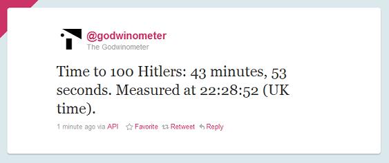
I had some spare time today, and was thinking about how planners should make things, and then I was thinking about Godwin's Law of Nazi Analogies. So I made this:

@godwinometer Twitter screenshot

@godwinometer listens to Twitter for references to Hitler. Then it works out how quickly the internet is churning out Hitler references, and expresses the result as a 'Time to 100 Hitlers': the time it's taken for the hundred most recent Hitler references to be tweeted.

@godwinometer tweets every fifteen minutes. It's sort of a measure of how crazy the internet is, right now.

(Of course, many of these could be legitimate references to Hitler by historians. But it's more fun if you don't think about that.)

The Godwinometer's written in PHP and is called by a cron job. Once it's been running for 24 hours or so it'll start auto-generating daily trended charts of activity levels in Hitlers Per Minute.

Just a bit of fun for people who like (a) the web, (b) numbers, (c) logical flaws or (d) Hitler (hmm, maybe not you). If you can find any use for it, enjoy.

# Alex Steer (06/11/2010)


Goodbye wristwatch, hello wrist

389 words | ~2 min

Interesting finding from Mintel on watches:

As many as one in seven Brits claim they have no reason to wear a watch as they use their mobile phone or PC to tell the time.

I imagine there will be a lot of coverage of this, most of it about the death of the watch.

So let's talk about the rebirth of the wrist.

Yes, we're actually only talking about 1 in 7 people, so maybe the figures are overhyped. And yes, 'many consumers view watches as an accessory rather than just a device to tell the time'. Though that only partly makes sense. A watch without a clock is a bracelet. So maybe it's good news for bracelets.

But let's run with the idea, just for fun. If the watch is dead, suddenly a whole piece of real estate opens up in your life. The space where your watch used to be. The space that you're conditioned to check from time to time.

Think about your wrist for a second. It's a part of your body that feeds you with data when you look at it. That's amazing. That's much better than having a smartphone.

If you watch enough science fiction from about the 50s to the 70s, it's full of devices whose common ancestor was obviously the wristwatch. They might be videos, radios, lasers or teleporters, but basically they're devices that make your wrist do magic. And then there are the brothers and sisters of the wristwatch, normally worn by runners and increasingly capable of recording and displaying sophisticated data.

Maybe I've just been watching Dentsu/BERG's incidental media too much, but talking about the death of the watch is just silly. If we can relegate a boring-but-useful function like telling the time to a device we can hide away when we don't need it (a phone), we can start thinking of brilliant new functions to put on wristwatch-type devices; functions that actually reward the kind of continuous partial attention your watch gets.

If you're wearing a watch, I bet you've looked at it at least once while you've read this. I'll stop before you look again.

# Alex Steer (05/11/2010)


Life's for sharing, TV channels aren't

617 words | ~3 min

Just seen the new T-Mobile giant participatory public-spacey follow-up-to-the-flash-dance-and-karaoke thing, which apparently ran across 80 TV channels simultaneously on Friday night.

To be honest, it's a bit like being hit by a truck.

Granted, it's impressive for sheer scale. The impact of it depends on knowing, as Campaign tells it, that:

An estimated 35,000 passengers coming through arrivals today [Wednesday 27th October] are being greeted by a crowd of around 300 people who are bursting into synchronised song and dance.

If you're there, aside from the minor coronary you might get from strangers running towards you shouting in a high-security environment like an airport, the effect is probably gobsmacking. (And yet, at the same time, probably a bit cringeworthy. One of the striking things about watching the spot is that you can feel people's embarrassment.)

For the rest of us, though, the impressiveness comes from being in on the secret (not that's it's a secret): believing that this is a form of highly-staged guerrilla improv - that not everybody on the screen knows what's going on. That, for all the slick editing, it's basically all real.

Because otherwise, really, it's just a big-budget ad. If all those people pulling their oh-my-goodness faces were performers too, it would lose both its charm and the sense that this was a massive event that took over a patch of the real world. We're asked to believe in the story behind the ad, in order for the ad to have maximum impact on us - the vast majority of people, who see the events on a screen, not in an airport.

But the media strategy kills that a bit for me. Putting it on 80 channels at once does not say, 'T-Mobile has made a moment of real-life magic so interesting and wonderful that you'll want to pass it on.' It says, 'T-Mobile has made an ad so massive that everything has to stop while you all sit back and appreciate it.'

Bang. Truck. Ouch.

I've grumbled a few times on this blog (I think) about the dark side to the kind of 'activation ads' that swept up the ad awards this year. Which is that, as well as obviously being great for their ability to generate empathetic delight (from viewers, for participants), they've become a vehicle for shock-and-awe advertising spending. Now that anybody can broadcast (cheers, YouTube), big activations are a handy new way to say 'I'm massive, you're tiny'. Can you build a giant treehouse? Can you bring the sun to some eskimos? Can you run through Heathrow singing at strangers without being shot? Thought not.

Oh, and can you block-book 80 TV channels at prime time? T-Mobile demonstrates that it is considerably richer than yow.

I'm deliberately over-reacting here, but I really don't like it. It's impressive, it's creatively very nice, but it feels bullying too, and precisely at a time when a lot of people are looking at their personal finances and have never felt smaller. It takes the feel-good edge off it for me.

Just think about what you could do with a 'Life's for Sharing' creative platform and a media budget of that size, in a country bracing for a huge contraction in civil society. Barclays, of all the brands, managed to come up with the London cycle sharing scheme. Imagine what T-Mobile, with huge resources and a nationwide mobile communications and data field, could make happen.

# Alex Steer (31/10/2010)


Yesterday's brand new is today's brilliant

327 words | ~2 min

Whatever you do, don't read my Delicious links. It's just a massive pile of stuff I think is interesting and I might need again. It's like reading the source code to my brain.

Yes, Delicious. And pretty much all the links are culled from Google Reader (thanks to the really handy Delicious extension in Chrome). Two technologies that were the Shiny New Thing a handful of years ago, and that people in the know now seem to have decided are dead. RSS and social bookmarking. I'm so 2006.

And they are brilliant. Brilliant because I don't feel I have to bother obeying any protocol. I rarely add notes, and I never tag or star items. I just use Reader to skim through over a hundred RSS feeds, really fast, and throw anything I want to keep onto Delicious. Retrieving it relies mainly on my own memory and my ability to use the simple search form.

In other words, it's exactly like my desk. Untidy, but useful, and mine. My disordered desk only makes sense to me. My mind happens to be quite ordered, which means I can find stuff in all the heaps of paper and scribbly writing.

Delicious now is the best version of the semantic web. Underpinned by strong semantic organization, but searchable (and therefore mess-about-with-able) on the surface.

I'd love to be able to shuffle my Delicious links around like notes on a desktop. Even things that emulate desktops (like Windows) never really feel mess-about-with-able. They feel rubbish for notes and work in progress - like you have to finish everything off so you can file it away neatly. I want an operating layer where I can leave stuff lying around, doodle on it, then either file it or throw it away.

In other words, I want a version of a filesystem that only really makes sense to me, with the upside being that it's completely intuitive. Hmm.

# Alex Steer (29/10/2010)


The massive importance of absolutely everything

580 words | ~3 min

Since moving to the US, I have learned a very important lesson, thanks to advertising. Which is that everything is massively, unbelievably important. Every issue, every previously trivial-seeming purchase decision, every household chore is effectively a matter of life and death. Pick the wrong shampoo, insurance policy or generic family car and you might as well shave your head, take up professional shark-punching and sell the kids into the slave trade.

So I think most of the ads here are ludicrously over the top. I started wondering if it was just a cultural difference - whether British (or for that matter South African) ads would just seem ridiculously round-the-houses and unclear here. Or whether this is a shift brought on by the recession, forcing marketers to reframe and reinforce their value propositions at a time of mass reconsideration by people about what's worth spending their dwindling spare cash on. There may some truth in both options.

But now I'm wondering whether advertising, on the whole, just lacks a sense of the trivial.

An essay on creative direction by Luke Sullivan, which I read today, used a phrase that will always remind me of someone I learned a lot about this industry from (because he used it a lot too). 'It's only advertising.' It struck me again how few pieces of maketing communication seem to have that sense of proportion.

For all that we'll tell you that the best brands are the most idealistic ones, or that engagement is all about rallying people around a big idea, in a lot of cases there's something a bit daft about the upshot of this: campaigns which try to make you feel like you're joining a social movement or extending the bounds of liberal democracy every time you choose a tin of beans. This may be good for the consciences of those of us that spend too much time with brands, but it stretches credibility a bit.

All this hard sell feels particularly wrong these days, because many of the most vibrant parts of popular culture, and especially Internet culture, thrive on the idea of not taking things too seriously. From Wikipedia to lolcats to #iranelection to blogging, the internet is the domain of the part-time project, the after-work spare-time pursuit, the collection of amateur enthusiasts making something great, taking it at once very seriously and not seriously at all. Wikipedia was built in people's spare time.

The kind of things we used to do in sheds, we now do on the web. Andrew Keen called it The Cult of the Amateur, and meant it in a bad way. I mean it in a good way.

The light touch of amateurism is one of the best things in the world. The combination of obsession and lack of seriousness is charming and powerful - the fact that we can spend so much time and energy on something, yet recognise that it's a bit trivial. Contrast that with so much advertising in which things are treated like the Holy Grail, and the ads end up sounding like the guy in the pub who never stops talking about work. (Again, irony noted.)

So maybe we need to tread carefully before we launch another 'massive idealistic movement brand' on the world. Maybe we fewer Brands With Causes, and more Brands With Hobbies.

In the words of every ad made in the last three years: What do you think?

# Alex Steer (27/10/2010)


Digital marketing like it's 1996

337 words | ~2 min

For whatever reason, today I found myself looking at this selection of corporate websites from 1996. That was the year I first learned HTML, so it's a bit of a trip down memory lane for me, as well as a chance to laugh at some howlingly poor design.

But as I looked, I realised something. These sites were thrown up in the days when digital marketing just didn't exist as any kind of discipline; when someone in the IT or marketing department with a bit of spare time and some basic image editing software would be tasked with chucking something onto the web server to stop it being empty. When there was, from the looks of it, very little oversight of what was being done.

And you know what? When you ignore the design, they're pretty good.

Have a look. Check out McDonalds, for example. The copy on the site reads:

Just click on the adults or kids to your right to enter our site as a grown-up or a child. Have fun! If you're interested in the fine print, now is an opportunity to check it out.

In other words, the kind of 'chatty packaging' tone that corporations now pay tone-of-voice consultants large amounts of money to reproduce.

Coke's weird little history lesson? Brand stories and heritage. Nickelodeon's 'Backseat Traveling Show'? A high-engagement microsite. Best Buy's extended holiday hours and terrifying animated pig? Brand utility and viral content.

Enough to reinforce the point I've long suspected. When someone asks you to 'deliver best practice in digital engagement', or whatever, what they're really saying is, please make your website feel like it was put there by a thinking, feeling, intelligent human being with a sense of humour and the ability to talk to people normally.

And from the evidence, maybe the way to start is to give your digital channels the kind of breathing space websites enjoyed back in 1996. Even if that does mean the odd animated GIF.

# Alex Steer (19/10/2010)


Spambulation

421 words | ~2 min

Starbucks and L'Oreal are, apparently, trialling a new location-based mobile marketing service with O2.

What this means, in human-speak, is that if you've told O2 you're interested in, say, food and drink, whenever you walk past a Starbucks you'll get an SMS or MMS on your phone telling you you can get coffee there (in case you don't know what a Starbucks is, presumably), and maybe offering a discount coupon. As BrandRepublic explains:

When opted-in O2 More customers are enter a geo-fenced area 'owned' by Starbucks, and they have registered an interest in food and drink, they will receive an SMS offering them money off at a nearby branch of Starbucks[...] O2 said that such a service does not infringe its customers' privacy because it is opt-in and they make the opportunity to opt out obvious for them. It does not send spam, only messages that are relevant to the customers' registered interests.

Okay, so technically not spam, by this agreed definition, since you have to sign up for O2 More, O2's direct marketing channel.

But it's a Faustian version of spam: the kind of thing that's easy to agree to when you sign up. The kind that, I'll bet, feels like you're being spammed every time you walk past a Starbucks and your phone starts beeping.

Push messaging is at once one of the most intrusive and one of the most disappointing channels. Not only does it come without warning, it comes disguised as something you might really care about, in the form of a beep on your handset, the sort of thing that more normally signifies a message from a friend. I'm not sure any coupon can make up for that.

And, of course, geo-fencing may not always be so responsibly gatekept. The technology exists, and is presumably more cost-effective the less discerningly it is used (though I could be wrong - any experts on the economics of mobile reading this?).

So could we be entering an age of frontier spambulation, where every trip down the high street is punctuated with exploding offers in your pocket?

I really, really hope not. Especially because the idea of a share of the world's air being 'owned' by a retail chain, though already one of the tenets of private property, somehow seems more obnoxious when that air is being used to hurl cheap marketing messages through.

File it under, 'Just because you can, doesn't mean you should'.

# Alex Steer (17/10/2010)


Getting medieval on your internet

427 words | ~2 min

This barely counts as a thought, let alone a point of view, but anyway.

I was reading this, and I thought: what is it with medieval literature and modern internet culture?

As I've no doubt mentioned here before, like lots of planners I came wandering into planning from somewhere far away. My somewhere far away was medieval and early modern historical bibliography. I wrote an MPhil thesis on it, I used to teach it, and I used to do it professionally (as a surprisingly large part of my lexicographical duties). So I can probably talk about medieval literary practice for even longer than I can talk about advertising, and almost as long as I can talk about the history of the English language. All of which makes me the worst person to be sat next to at a dinner party. I can read medieval handwriting, I can do a half-decent physical description of a manuscript, I know more than is quite proper about vernacular miscellanies of the late thirteenth century, and I honestly never thought it would be of the slightest use to me once I moved away from that world in 2008 and went into strategic planning.

Wrong.

Because it turns out that the two things bibliographically-minded medievalists have to know about are two of the things that modern internet culture is learning about all over again: the relationship between form and content in communications, and the synthesis, transmission and reception of ideas in culture.

So I'll see your 'is Facebook eroding privacy?', and raise you a 'did print destroy intimate social networks of communication?'. Give me your retweets, and I'll give you Thomas More's Confutation of Tyndale's Answer (look it up, it's brilliant, like reading an email with too many layers of quoted text).

If you want to talk about the social life of media, find a historical bibliographer. I've worked out what this post is. It's a plea to people who teach what now normally gets called 'history of the book' to use the debates we're having now about communication to get people into their field. And it's a plea to any agency or organisation who cares about communications media to seek out the people who know a bit about its past. You'll find them in the library, thumbing through Pollard and Redgrave's Short-Title Catalogue and muttering about signature numbering.

If they're anything like me, they might not have realised how interesting the future of the book is too.

# Alex Steer (14/10/2010)