Alex Steer

Better communication through data / about / archive

Public knowledge about things you don't know

767 words | ~4 min

A month ago the Guardian reported on Shadow Education Secretary Michael Gove's plan to create an online library of past school examination papers going back 'to Victorian times'. The article included a quote from Michael Gove, saying:

It is vital that we restore public confidence in our exam system. Universities, businesses and academics say the system has been devalued.

This may be true (and in some cases it is demonstrably true), but publishing an archive of exam papers is more a way of stirring up fears of dumbing down than it is a way of restoring public confidence in the exam system.

In much the same way that it's always September somewhere on the internet, when it comes to stories about school standards it's always August. When this story broke, of course, it was actually August: that 'silly season' period of slow news when Parliament and the law courts are recess, everyone's on holiday and, sadly for students everywhere, GCSE and A Level results are released.

This unhappy coincidence means that every year we are treated to a rush of news stories put together around DCSF statistical releases, magazine pieces consisting mainly of pictures of teenagers opening envelopes, and op-eds about how it's all going to the dogs. Followed by more op-eds about how it's not all going to the dogs and we should be proud of the continued average grade improvements. Followed by more op-eds from the authors of the original op-eds about why this is short-sighted and it actually is all going to the dogs. (Followed, inevitably, by blog posts like this one. Sorry.)

The proposal for an archive of exam papers feels like a way of enshrining this silly season attitude to education, capturing it and making it available to us at any time of year.

Start leafing through Victorian (or otherwise old) exam papers and you will pretty soon start to feel stupid. Compare them to some GCSE papers from last year and you might notice that you know (or can have a stab at) more of the answers from the recent papers than from the old ones. You might then conclude that this is because modern-day exam papers are easier than those set in the late 19th century, and raise a concerned eyebrow at the state of the nation's young minds. And hey presto, your own silly season has begun.

This is because ease, like other things, is in the eye of the beholder, and unfamiliar things seem difficult because they are unfamiliar. As you might imagine, historical (beyond a few years) and contemporary curricula are in no sense alike for the majority of subjects, and many subjects now exist which did not in the past. The expectations and demands of schooling have changed enormously, in response to changes in theories of learning and the economic and social requirements of education, and syllabuses have changed with them. As a result, old exam papers contain things you should not necessarily be expected to know. They will also have been marked according to a standard that you might not understand.

This is not to say that there is no such thing as grade inflation, or to take a particular side in the silly season debate, but it should be noted that uncontextual historical comparison by biased viewers does not make a fair test. Only in a very few cases, notably some areas of mathematics, is it possible to make relevant comparison, and even then the findings shouldn't be extrapolated too widely. (Grade inflation in some maths subjects does not imply easier exams across the board.)

This proposal is a way of damaging confidence in the existing system by making it look too easy, not of restoring confidence. The cognitive bias that it induces is also a way of affirming a conservative (small 'c') set of subject distinctions within education. Once you have convinced yourself that exams are getting easier, you may also convince yourself that new subjects (media studies, business studies) are inherently less valuable than traditional ones (history, Latin). Of course, you might conclude this anyway, but if you do, make sure it's for a cogent or at least honest reason, rather than because of private ignorance acquired under the rubric of public knowledge.

# Alex Steer (02/09/2009)

Wikipedia: growing up, not getting old?

485 words | ~2 min

There have been quite a few newspaper and online articles recently reporting that Wikipedia's's growth rate is slowing. These have taken a pretty alarmist approach. One of the articles linked to above is headlined, 'Is Wikipedia a slow death?'. Another hypothesises that an increase in 'editorial control' over entries may be putting people off.

The research comes from the Augmented Social Cognition Research Group at Palo Alto Research Centre (PARC), and is laid out on its blog. It's good work, and shows that the idea that Wikipedia's growth was exponential (as it looked for the last few years) was wrong. The level of editing activity has slowed in 2008 and 2009 (note: not the new-article creation rate - you'd expect that to drop anyway as the result of a backlog effect). The evidence is there, and it's robust and conclusive.

That doesn't mean Wikipedia is dying, though. The assumption in a lot of these articles is that would-be editors are either annoyed or bored with Wikipedia, and are deserting it. Having worked on a different-yet-similar collaboratively-driven editorial knowledge project, I think there's a better explanation.

Here's my hypothesis: Wikipedia is not dying but maturing. As it becomes a more comprehensive resource, glaring omissions and errors become fewer, so many of its readers no longer feel the need to alter it. They turn from active editors into users who have the power to edit, but do not necessarily exercise it.

The PARC research segments editors of Wikipedia according to how many edits they have made. It has found that the top two tiers (100-999 edits and 1000 edits plus) have grown their share of editing activity from about 55% in 2007 to about 60% today. Those who tend to edit less (call them the 'casuals') are editing even less; those who tend to edit more (what you might call the 'pros') are editing even more. Unfortunately I don't have the segment sizes, so can't tell if there are more or fewer casuals and pros, relatively or absolutely, than there were before. We'll have to wait for the data to be published at WikiSym 2009 in October.

Decreasing user activism need not mean users are getting fed up with a resource. It might mean they're becoming happier.

Update (18/08/2009): Newsy has a piece on the different angles on this story, including Alexa data showing site usage continuing to grow. Thanks to Daniel from Newsy for pointing me to this.

# Alex Steer (17/08/2009)


29% more boring stories about your gap year

571 words | ~3 min

Powerchex, a pre-employment screening company, has informed the world (via the Guardian) that under-21s 'told 29% more lies on job applications this year than last'.

Leaving aside potential conflicts of interests arising from companies who sell services conducting research into the extent of need for those services, this headline sounds a bit odd. That's because it is.

Let's do the linguistics first. '29% more lies' is a phrase made up of an adverbial phrase ('29%'), and adjectival/determining phrase ('more') and a noun phrase ('lies'). The whole phrase is the object of the transitive verb 'told'. (We'll ignore 'on job applications this year than last' for now.)

The subject of 'told' is plural: 'under-21s'. The plural subject implies multiple instances of individual action (as in 'three poets died this year') or collective action by multiple actors (as in 'three teenagers stole my car today'). Taken as a whole, 'under-21s told 29% more lies' means that, through simultaneous or collective action, under-21s increased the number of lies told on CVs by 29%. If there were 100 lies on CVs last year, there were 129 this year.

Which is not what the report says. It says that 29% more under-21s than last year told lies on their CVs. In other words, if there were 100 liars last year, this year there were 129. The number of lies told is not specified.

Which means what?

Of 4,735 job applications from all age groups sent to finance firms between June last year and this May, 899 contained false information.Powerchex... found that of the 307 belonging to under-21s, 18% contained lies, an increase of 29% from last year, when only 14% of forms contained false information.

So in fact while the relative risk increase is 29%, the absolute increase is (18 - 14 = ) 4%. Given that we're talking about individuals here, let's put that in human terms. Of 307 under-21s applying to finance firms, 55 told lies on their CVs, compared to 43 the previous year.

Is this a significant change? Is it related (as opposed to just correlated) to the recession? It's hard to know. According to the Guardian piece:

Alexandra Kelly, managing director of Powerchex, said: "The pressure of the recession on job markets seems to have led more applicants to believe that they should lie or make embellished claims to get jobs."

Well, maybe. On the other hand, 12 people out of 307 could be insignificant variation, a natural progression away from or towards the mean. Longer-term data is needed. So might a larger or more representative sample - this is a market (graduate finance intake) in which one large firm alone can still hire 1,000 graduates, despite 32% of organisations operating a graduate recruitment freeze this year. It's hard to tell from the article whether or not this trend can be taken seriously.

Yes, this is pedantry, but it's also marketing. Lots of organisations are throwing round 'recession mania' stories at the moment. If you think you have an insight, check your numbers, check your wording, and proceed with caution.

# Alex Steer (07/08/2009)


Plummeting to the mean

251 words | ~1 min

Clearly today is a bad day for the public understanding of simple numbers.

Could the author(s) of this article (headline: 'I don't: number of 'gay weddings' plummets') please look up the term 'backlog'.

Not that you need look far, since despite the headline the reason is given by Peter Tatchell halfway through the article.

'After civil partnerships were legislated there was a huge surge of couples who had been together for decades who suddenly wished to take advantage of the legal recognition.'

Which makes the opening paragraph's claim of 'speculation that, like heterosexual services, [civil partnerships] have fallen out of fashion' a bit fanciful.

The prize for the worst error of judgement goes to some unnamed 'government officials', though.

When Government officials drew up the new laws for civil partnership they estimated that five per cent of the population was gay or lesbian and predicted that 62,000 gay couples would register in the first five years of ceremonies.

62,000 is, as far as I can tell, an absolute back-of-the-envelope calculation that you get if you take the rough number of heterosexual weddings in the UK, take 5% of it, and multiply it by 5. This is not public-sector insight research at its best. (That said, if there is evidence that the government conducted some more research into the extent of demand for civil partnerships, I'd be delighted to be corrected.)

# Alex Steer (04/08/2009)


Guardian fails on Sats reporting

533 words | ~3 min

The Guardian has been getting itself into a muddle over its reporting of the Sats results.

At 11.49 this morning it published a version of its story to the RSS feed on its website which contained the following lines:

Of the 600,000 pupils who took the tests, 72% did not reach level 4, compared to 71% last year. This means they cannot add, subtract, multiply or divide in their heads, or write extended sentences using commas.

An hour or so later, when I checked the website itself, this had been amended (my emphasis):

Of the 600,000 pupils who took the tests, 72% reached level 4, compared to 73% last year. This means they cannot add, subtract, multiply or divide in their heads, or write extended sentences using commas.

First of all, this obviously makes no sense as a sentence now. The 72% are the ones who can add, substract, etc.

Second, given that the whole thrust of the piece is about declining standards in schools and possible marking inaccuracies, the lack of attention to detail here is striking. Guardian, check your stats and sort it out before you publish next time, not after.

This is not the only problem with this article, though. Take a look at the results and you'll see that these changes are pretty minimal: no change in maths and science, and a 1% drop in children achieving Level 4 in English, reading and writing. This is not good news, obviously, but neither is it an educational catastrophe.

The Guardian, post-correction, states the figures accurately, but uses an inconsistent style of description to make them sound as bad as possible. For example:

More than a quarter of 11-year-olds in England failed to achieve the standard expected of them in their English and maths Sats.

Given that this standard (Level 4) is what is expected of 'a typical 11 year-old' (source), it's not surprising that around a quarter are below it. More than a quarter are also above it: Level 5 achievement - in other words, 11 year-olds attaining the level of a typical 13 year-old - ranged from 19% in writing to 47% in reading.

Try this...

The statistics from the Department for Children, Schools and Families showed boys were falling far behind in writing. Four out of 10 boys did not reach the level expected of them, while 75% of girls did.

Using a negative natural frequency for boys ('four out of 10 boys did not') and a positive percentage for girls ('75% of girls did') is unfair, as the eye and mind gravitate towards the 'four' and the 'seven(ty)'. In fact the attainment difference is 15% - again, clearly a problem, though this is by far the largest differential.

For cherry-picking worst cases and wording them as direly as possible, not just for the shoddy and unmarked correction of published material, this article fails to achieve the standard expected for education journalism.

# Alex Steer (04/08/2009)


Bad news: your dictionaries are worthless

120 words | ~1 min

Chris Anderson, editor of Wired, in an interview with Der Spiegel:

I don't use the word journalism.

Then...

Sorry, I don't use the word media. I don't use the word news. I don't think that those words mean anything anymore.

Followed shortly by...

There are no other words. We're in one of those strange eras where the words of the last century don't have meaning.

Fortunately, the word 'pretentious' seems to have clawed its way into the 21st century for precisely this purpose.

# Alex Steer (31/07/2009)


Fair access to the professions

902 words | ~5 min

The Panel on Fair Access to the Professions has released its final report, Unleashing Aspiration. One of its central arguments (which, alarmingly, seems to have been in place since before the panel was set up), is that 'social mobility into professional careers has slowed', and that 'if action is not taken to reverse historical trends, tomorrow's generation of professionals will today grow up in families that are better off than seven in ten of all families in the UK'. These arguments, and the evidence behind them, are laid out in Chapter 1 of the report. However, some of the reasoning is distinctly questionable.

To start with, the definition of a profession seems purpose-built to exclude those which are less exclusive, and thus lend weight to the central argument. The list of example professions given reads:

‘Life science’ professionals, such as doctors, dentists, nurses and vets; Legal professionals, such as judges, barristers, solicitors, paralegals and court officials; Management and business service professionals, such as accountants, bankers, management consultants and business and finance advisers; ‘Creative industry’ professionals, such as journalists, publishers, designers, writers and artists; Public service professionals, such as senior civil servants, managers in local government, armed forces officers and senior police officers; Scientists, such as archaeologists, chemists, mathematicians and physicists; Education professionals, such as professors, lecturers, teachers and early-years specialists; and Built environment professionals, such as architects, engineers, surveyors, town planners, urban designers and construction specialists.

With the exception of 'construction specialists' (slightly vague), there is no mention of what used to be called trades: the builders, fitters, bricklayers, plumbers, electricians, stonemasons, thatchers and the like whose occupations all fit the report's criteria of having recognisable entry points, codes of ethics, systems for self-regulation and a professional development. From a government that so trumpets its investment in apprenticeships and training, this seems a curious omission.

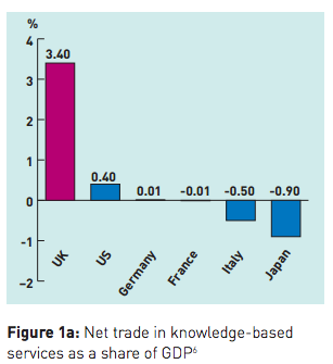
The following figure is used to make the claim that 'the UK is a world leader when it comes to knowledge-based services':

Fair Access - country comparison, knowledge-based services

Though this suggests that the UK needs a better spread away from knowledge-based services, which a quick analysis of our economic situation would tell you anyway. (The definition of a 'knowledge-based service' is hazy too - it's not clear whether, for example, doctors count as knowledge workers.)

The report also rolls out a variant on the usual inaccurate story about declining social mobility (see my link above). Writing that 'there is some recent evidence that the UK may have reached the bottom of a long-running decline in social mobility', the authors of the report make the common mistake of treating measures of intergenerational mobility from previous longitudinal studies as points on a line rather than discrete snapshots, and of assuming a continued downward trend which is not necessarily correct (and which, given the length of time it takes to gather evidence, we won't be able to see for years yet). This does not detract from the analysis which suggests that social immobility remains a problem.

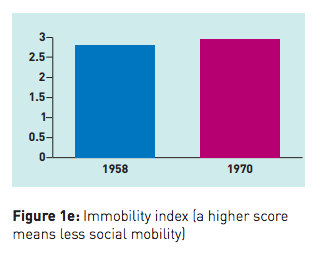
This chart is also telling:

Fair Access - social mobility index UK 1958 vs 1970

The analysis on this is incredible. This is presented as evidence of 'growing social exclusivity' among the professions, and four reasons are given for the trend.

  1. 'Opportunity hoarding' (i.e. elitism) by professions;
  2. 'Qualification inflation' as more professions require higher qualifications
  3. Lack of movement from vocational training into professions
  4. Concentration of professional jobs in London and the South East

The most striking insight from recent comparison studies on social mobility is completely omitted. This is that there is a strong link between parental income and educational attainment.

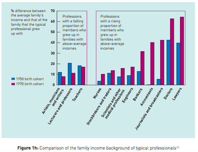
This insight is the killer. Bear it in mind, and the over-representation of the children of rich families in professions requiring high-level qualifications is thrown into a different light. Rich kids, in short, do better at school, get to better universities, and get into better jobs. The higher average educational attainment of rich kids also explains, in large part, the strong intergenerational income correlation: rich parents are most likely to have kids that end up rich, and the education system is a significant vector by which wealth is passed on. And looking at the chart above, it's no surprise that the professions that hire the most rich kids are the ones with high salaries: law, medicine, finance and accounting. (Journalism is a fascinating anomaly that says a lot about the changing role and perceived power of broadcasters.)

Seen through the lens of this insight, the big story about mean elitist professionals pulling up the drawbridge to keep the insiders in and the outsiders out looks pretty insignificant. This chart, though, takes on a whole new significance:

Fair Access - social mobility by professional group

It tells the story of a generation of children from rich parents who have been sent to independent schools, where they have received an education far better geared to helping them achieve high qualifications and professional jobs than the education received by their peers who were reliant on state provision. Without really meaning to, this report damns a generation of state educational policy and exposes its role in hindering access to the professions.

# Alex Steer (23/07/2009)


Weak signals about mobile technology

529 words | ~3 min

The eMarketer website has published the findings of a study it commissioned from Lightspeed Research on mobile phone use in the US, UK, France and Germany.

For the UK, it's no surprise that texting and voice calls are the most common types of use (82% and 75% at least once a week, respectively), though as eMarketing points out the figure of 22% that browse the internet weekly is a surprise. This seems to me to reflect a change in thinking about what mobile devices are for that has been going on for a few years now, and is most clearly seen in convergent devices like the iPhone and Blackberry.

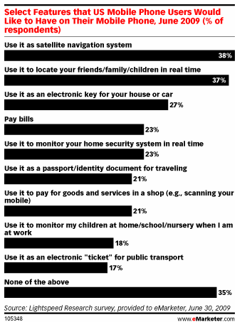
What's really striking, and not given much comment by eMarketing, is the result for features that US mobile users would like to have on their phones, reproduced here.

eMarketer mobile survey 2009 - desired features

Taken on their own, these responses are fairly interesting and provide fairly strong signals about what might come next in mobile: expect to see more devices with satellite navigation and similar GPS tools hitting the market soon, for example. But taken together, I think they reveal something more subtle about how mobile use might change over the next few years.

Several of these responses reimagine mobile devices as tools that transform the relationship between people and the spaces they inhabit. Satellite navigation is the strongest manifestation of this: it tells you where you are and helps you get where you need to be. In doing so it maps data on the real world you inhabit, turning information about distances and directions into instructions that centre on you: turn left, turn right, in 20 yards, stop. But sat nav is just the most obvious version of an idea of mobile devices as things that connect people to the world, and not just in the old-fashioned sense of being able to speak to one another. A mobile device that can locate people and monitor systems remotely is as much a translation device as a communication device, helping people to understand and transcend the physical spaces within which they exist, and to overlay otherwise-invisible layers of data onto the here and now.

It's hard to describe these emerging phenomena without sounding either too technical (talking about embedded sensor architectures) or too mystical (riffing about the demon-haunted world of the internet of things). But it's because these things are at the edge of mainstream understanding that they're worth thinking about. This survey, along with the appearance of the first few augmented reality applications, seems to hint that a new way of thinking about mobile is starting to creep into public consciousness.

# Alex Steer (21/07/2009)


If you are dead, press 1

535 words | ~3 min

The National Pandemic Flu Service is due to be launched this week. Essentially it's a phone line and website which tells people if they have swine flu and, if they do, directs them to treatment.

Apparently having one phone line that you can call to ask questions about your health, as well as a nationwide primary care system, isn't enough, and we need something else as well. I especially love the indignant tone from the Lib Dems' health spokesman, Norman Lamb, complaining about the 'additional burden' on GPs of 'a large number of calls', as if he can't believe that people are so stupid as to be phoning up their GPs when they feel ill. I mean, next they'll be onto the police just because they've been stabbed.

In amid all this urgency around public health, there are surely a couple of important points about good communication. The first is that innovation should strengthen brands, not detract from them. How will the NPFS relate to NHS Direct, the online and phone-based health advice service that already exists? Unless some good reasons are given, it will seem very much like NHS Direct is a brand that's fine for cases of man-flu, sniffles and sprained thumbs, but incapable of coping whenever the pathogens hit the fan. Once the NPFS folds, the lingering perception of the NHS Direct as a sort of telephonic mecca for timewasters will do it no good and may discourage people from using it.

The second point is that communication needs to be consistent and coordinated. Not in the sense of endless messages pushed out on every channel, but in the sense that if, at any given time, I want to know what I should do if I feel ill, I should be able to find out quite straightforwardly. Better yet, I should already know. There is already too little clarity about the respective roles of NHS Direct and GPs. Which should I go to if I think I've twisted my ankle? When the NPFS arrives, if I think I have flu-like symptoms, which of three ports of call do I choose? If I don't know by the time I fall ill, someone has failed.

Coca-Cola, which basically sells sweet brown fizzy water, is great at differentiating its brands. Everybody knows the difference between Coca-Cola, Diet Coke and Coke Zero - why the three exist, whom they're targeted at, and what their branding looks and feels like. If they feel the need to put so much effort in to sell three strains of almost identical liquid in tins, surely the imperative is far stronger when it comes to giving people advice and treatment which could save their lives.

Posted via email from Common Parlance

# Alex Steer (20/07/2009)


Pret makes things out of people

847 words | ~4 min

Image lost in database transfer - sorry!

I couldn't resist that subject line, but there's a point to it.

The blurred, grainy photo in this post (taken with my slightly ropy phone camera) is of a customer comments card I found this weekend in the Cambridge branch of Pret, the sandwich shop. The card reads:

My name is Marcus. I'm the Manager at this Pret shop.
My team and I meet every morning.
We discuss the comments you've made, the good, the bad and the ugly. If we can deal with it ourselves, we will.
If we can't, I'll forward this card to Julian Metcalfe back at the office. I know he'll do what he can.
If you have a minute, please do ask to speak to me or one of my team right now.

The space for comments is on the back.

For all its simplicity, this is the best feedback form I've seen in ages. It wins for a number of reasons. The first is the design, for doing what any personalised marketing object should do now that printing is cheap, quick and easy, and refusing to make the names of the branch owner and (I presume) local area manager look like afterthoughts. Pret is an international brand, but just by printing different cards for each of its outlets it gives itself a local feel. Imagine how much worse it would look (my photography notwithstanding) if the names had been written in over a dotted line.

But the design is just part of the achievement. Most of the work is done by the tone. The use of the first person is something I haven't seen before on a card like this, at least not without an accompanying cheesy picture of some branch manager wearing an 'I care' smile. The is polite but informal (see the use of contracted forms - I'm, you've, I'll, he'll - as well as idiomatic expressions - the good, the bad and the ugly; deal with it; do what he can - and the obligatory dummy verb in please do ask). As readers we can tell that this feels more like informal talk than legally and formally precise 'business speak'. As I've discussed previously, analysing sociolinguistic tone - saying what makes a piece of language sound informal or businesslike - is harder than it seems, and relies on the aggregation of lots of small items of usage, or their absence. (Note the total lack of professional jargon here - the closest we get are the words 'manager' and 'team', not very close at all.)

The effect is to transform the card into the speaking voice of the branch manager, and to make the manager sound approachable. Given that comment cards are essentially a way of making sure that branch managers can avoid speaking to customers while still letting those customers feel they've had their say, this is a neat conjuring trick. These days, we know that comment cards, like automated phone lines, are barriers between companies and their customers. This card does not feel like that, partly because of the tone, and partly because it is less like a wall and more like a window into the daily operations of the Cambridge branch of Pret.

Finally, rather than being an instruction to take a number and join the queue, the card actually invites customers to disrupt the entire purpose of the comment-card system: 'please do ask to speak to me or one of my team right now'. The emphasis is even put on the customer's convenience: 'If you have a minute'. This card invites its reader to see that Pret is made out of people, not just business functions, but it also acknowledges that the reader is not part of that system, and so offers different ways of getting a message through and being heard.

Posted via email from Common Parlance

# Alex Steer (20/07/2009)